Introduction
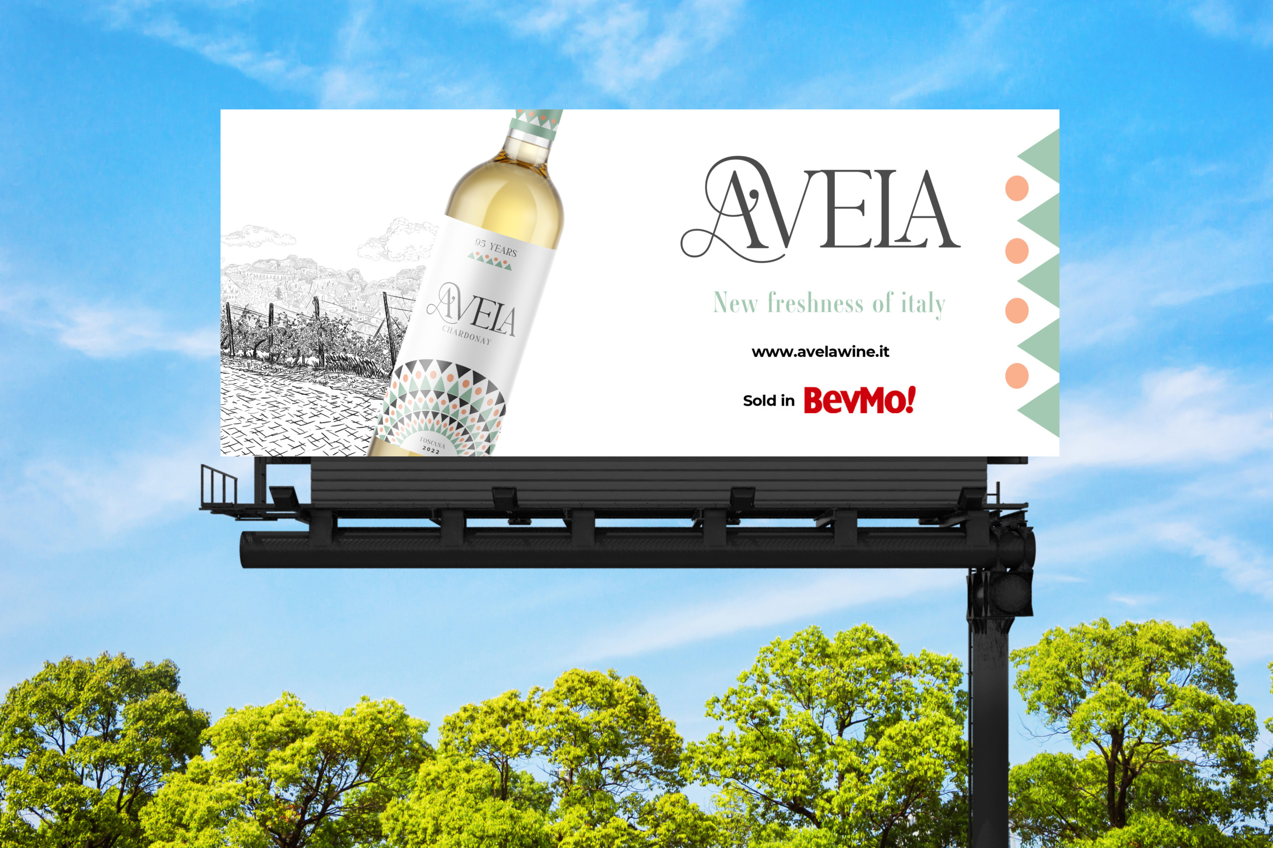
Avela is a new Italian white wine that was launching in a crowded and competitive market. The winery approached our design agency with the goal of creating a unique and attractive brand identity for the wine that would stand out on store shelves and appeal to the target audience of wine connoisseurs.
Background
Prior to the branding project, Avela did not have a cohesive or distinctive brand identity. The wine was being sold in plain bottles with no label or packaging design, making it difficult for the winery to differentiate their product from other white wines on the market.
Research
Our design team conducted extensive research to understand the target audience for Avela and the competitive landscape for Italian white wines in the US. We gathered insights on the preferences and behaviors of wine connoisseurs, as well as an analysis of the design trends and features that were most successful for similar products.
Design process
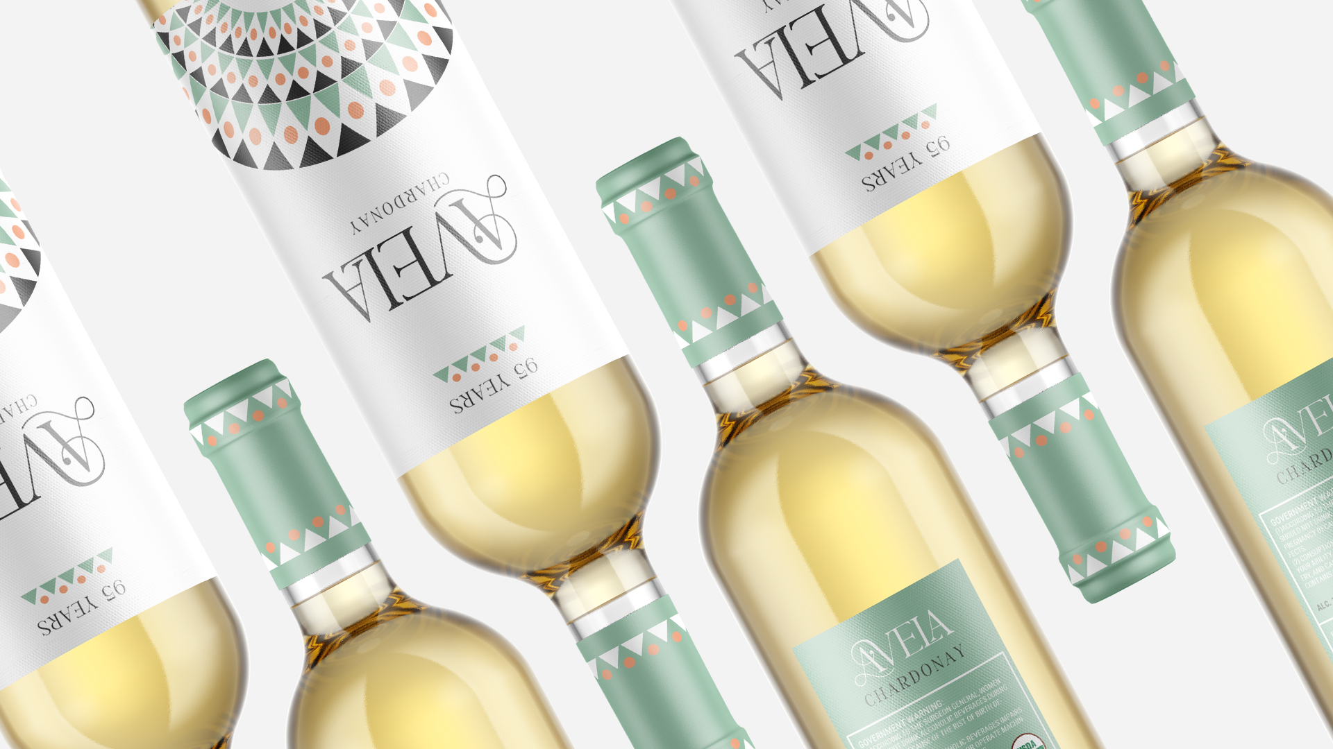
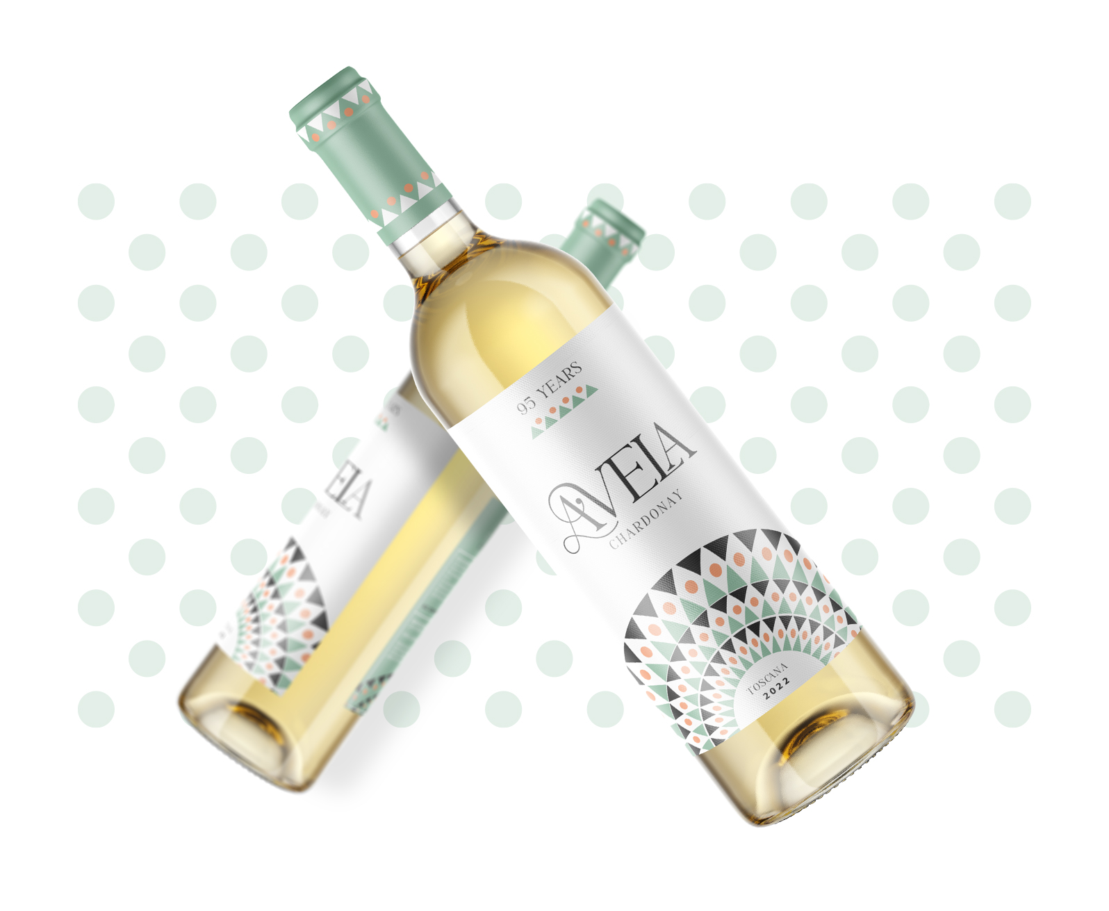
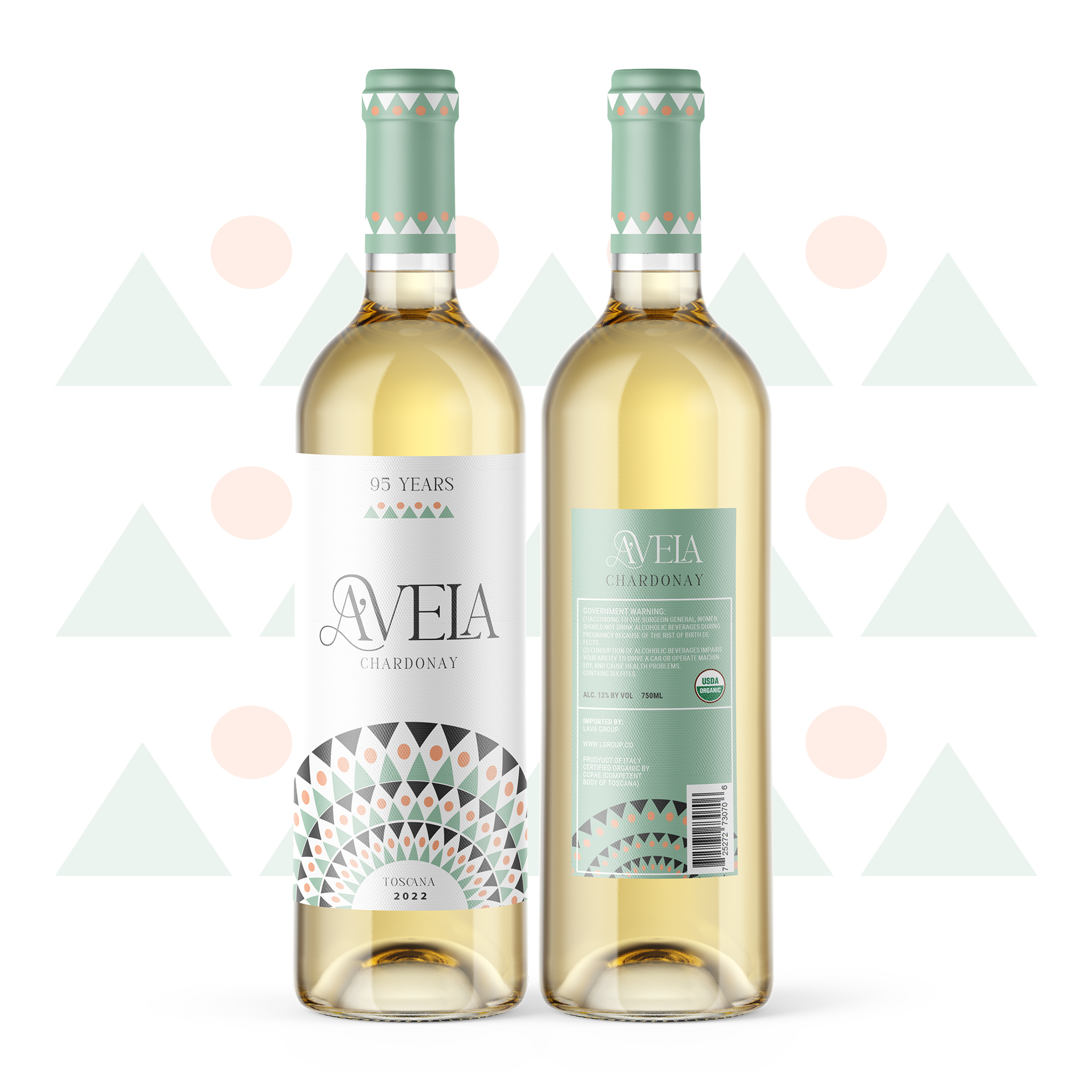
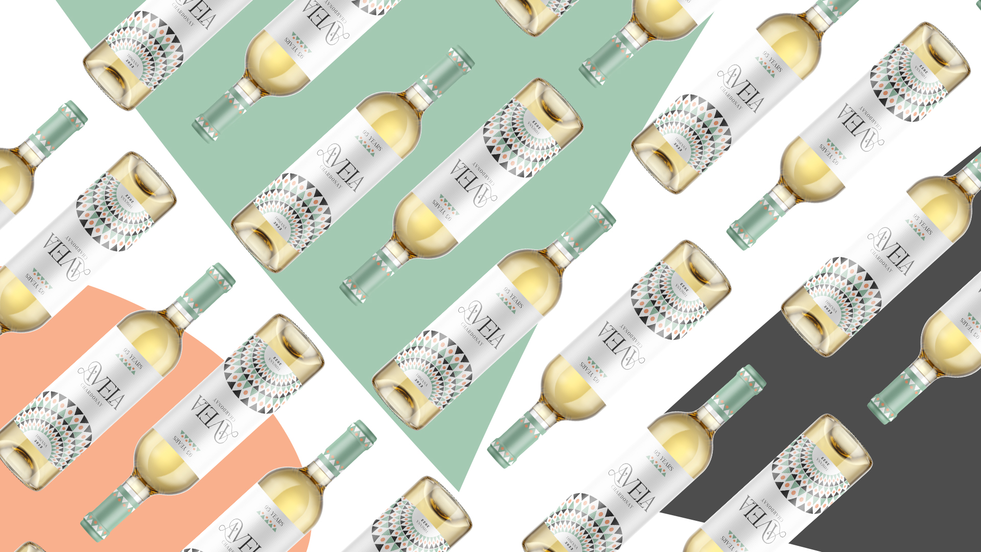
Based on our research, we developed a brand identity for Avela that incorporated a sophisticated and modern aesthetic. The label design featured a minimalist design with clean lines and a simple pastel color palette of fresh mint and vivid tangerine. We also designed packaging materials, including a box and wine tags, to further enhance the brand’s visual appeal.
Results
Since the launch of Avela with its new branding and label design, the wine has gained a loyal following and achieved strong sales. The sophisticated and modern aesthetic of the brand identity has helped the wine stand out on store shelves and appeal to the target audience of wine connoisseurs.
