Emmings Hotel, a property located in London, was in need of a new logo and corporate identity to refresh their brand and better reflect the upscale atmosphere of the hotel.
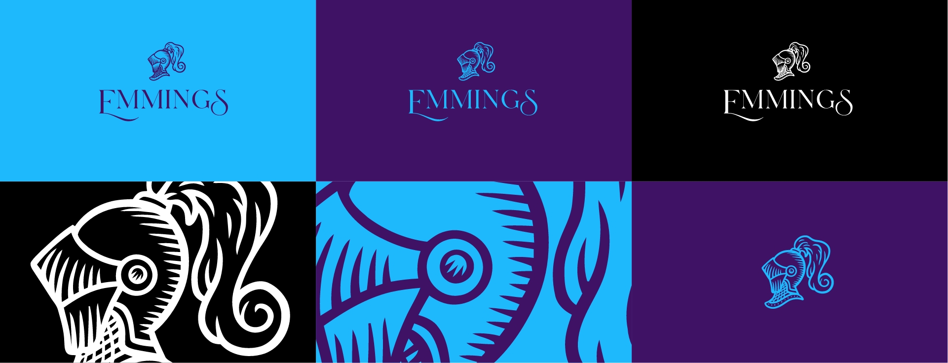
Our agency, was hired to create a new logo and corporate identity for Emmings Hotel. The design team at Brainbox chose to use a knight’s head shield as the focal point of the logo, drawing on the historical and regal associations of knights to reflect the hotel’s upscale atmosphere. The color scheme chosen for the logo and identity was a combination of deep purple and vibrant blue, creating a bold and sophisticated aesthetic.

Research: Brainbox conducted research on the hotel industry, and the target audience of Emmings Hotel, to gather inspiration and develop an understanding of the hotel’s brand positioning.
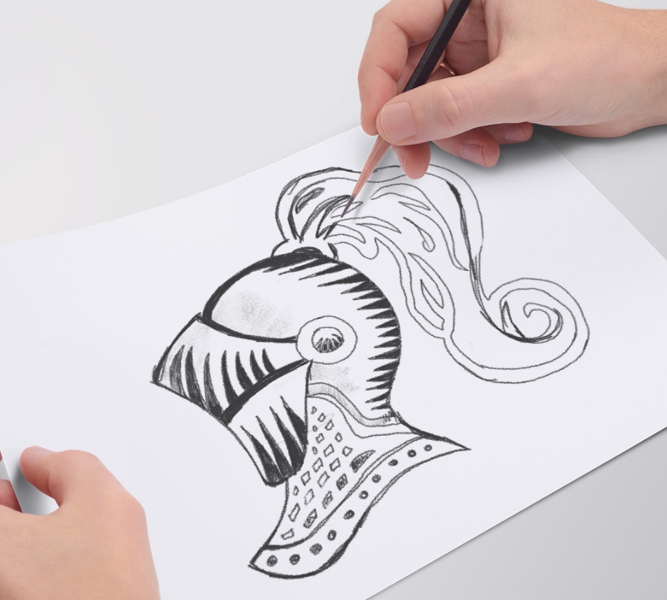
Conceptualization: Brainbox generated several concepts for the logo, each incorporating the knight’s head shield in different ways.
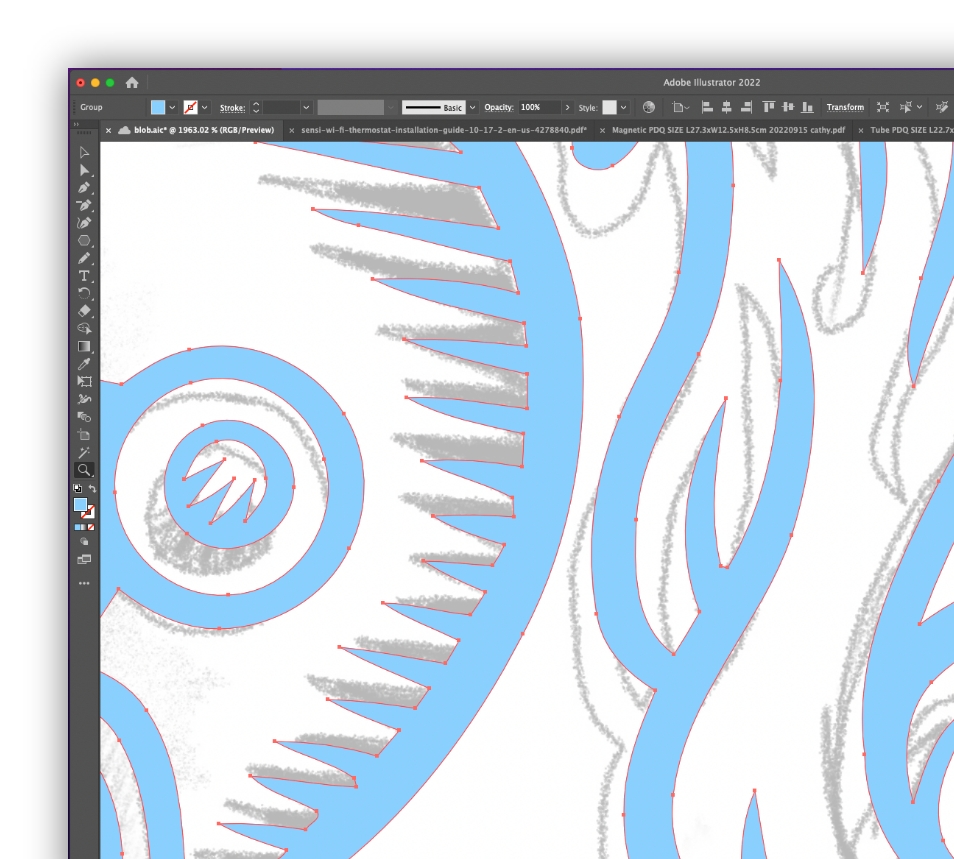
Refinement: The team then narrowed down the concepts and refined the chosen design, until a final logo was selected.
Roll-out: The new logo and corporate identity were applied to all of the hotel’s marketing materials and signage, creating a cohesive and distinctive visual brand for Emmings Hotel.
Implementation: The final designs were delivered to the client and implemented across all communications and touchpoints of the hotel.
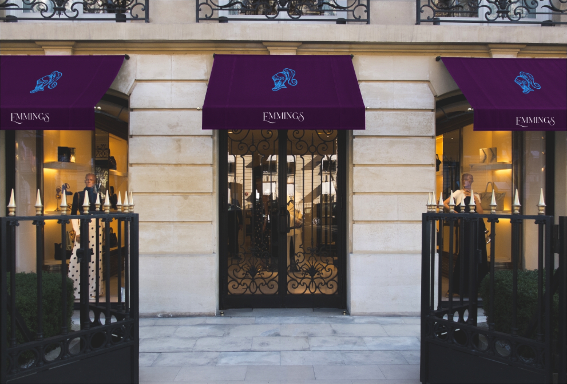
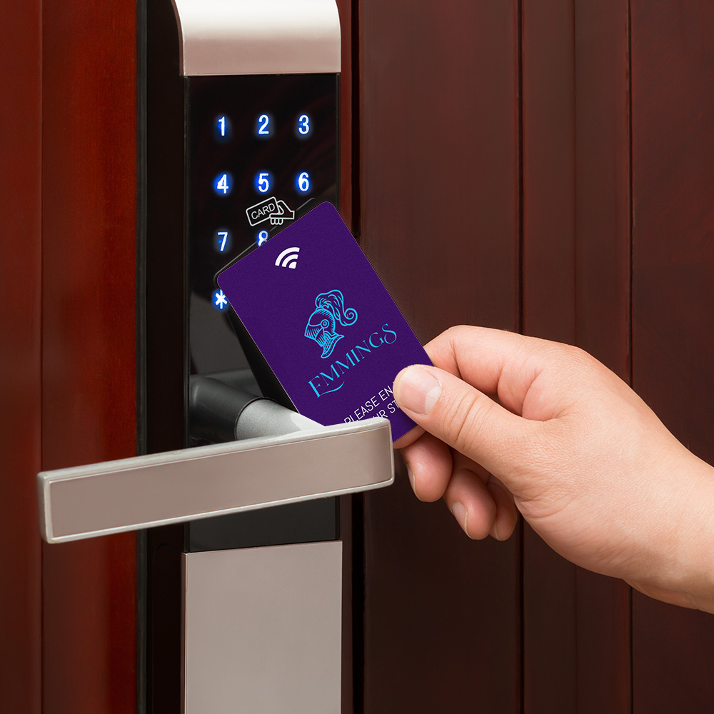
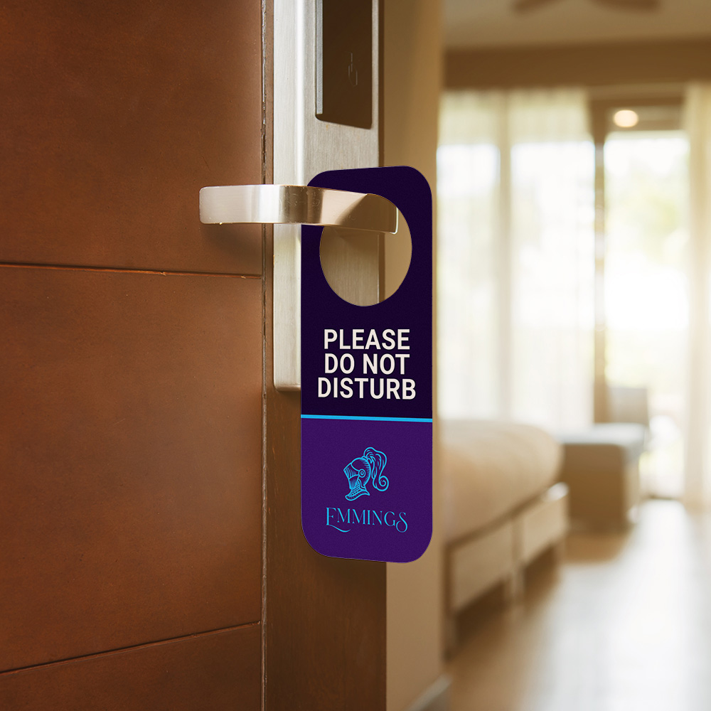
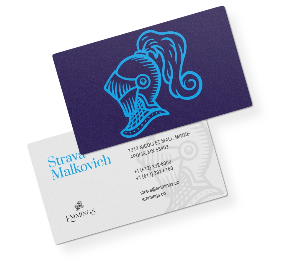
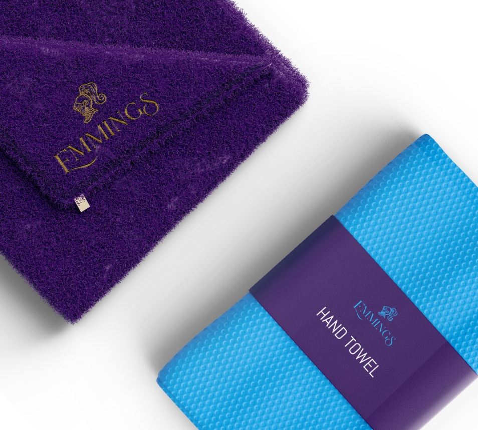
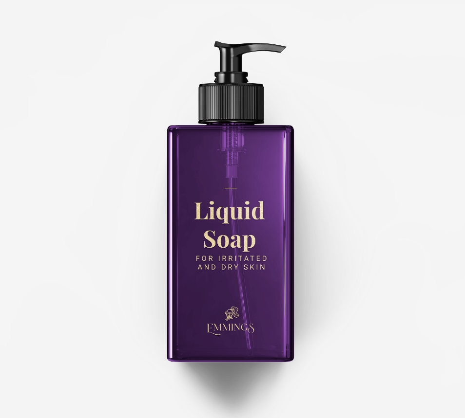
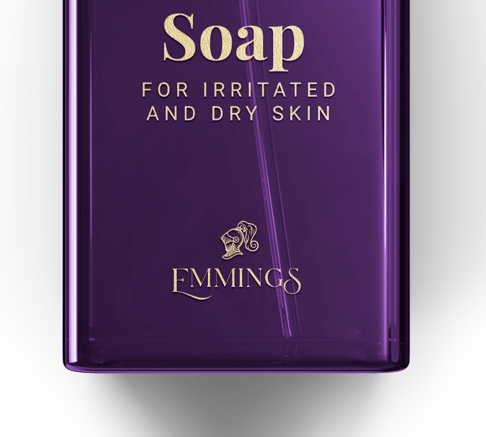
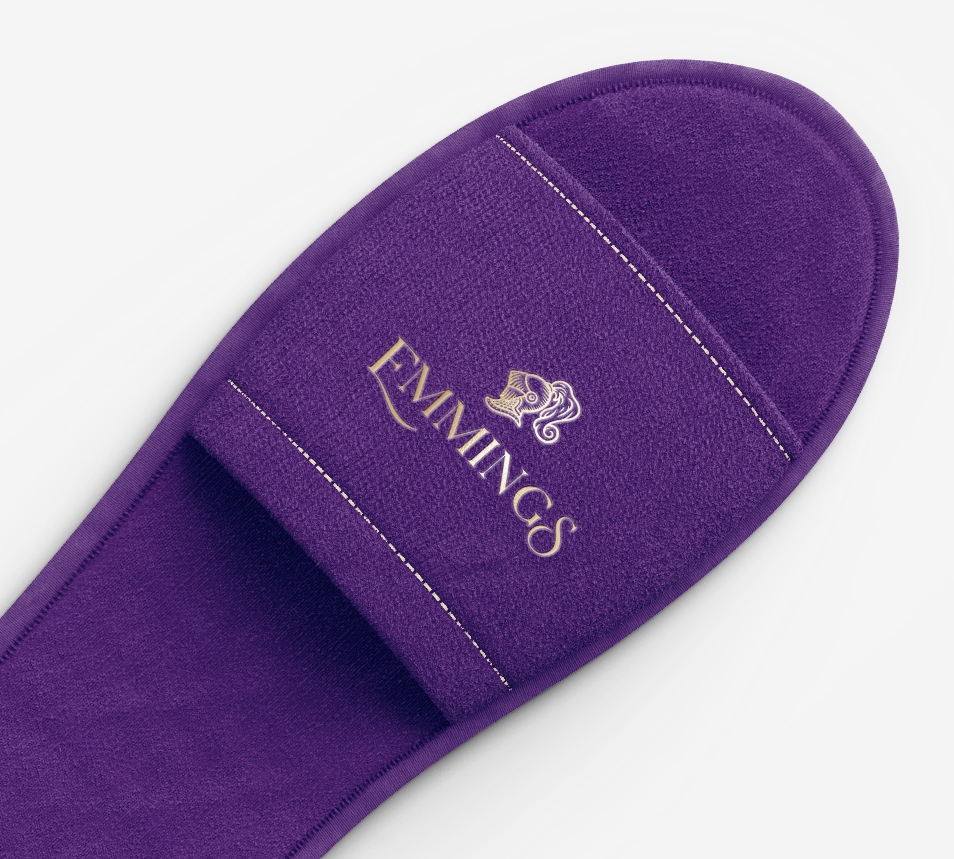
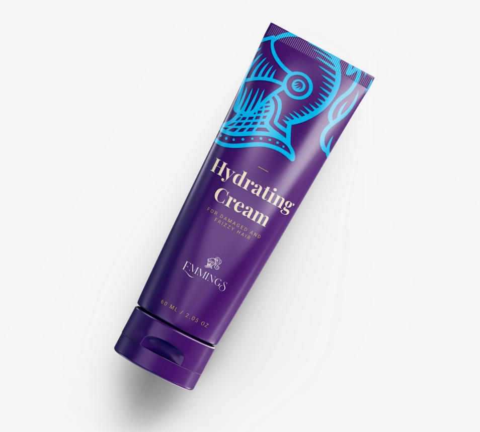
As a result, Emmings Hotel now has a refreshed and sophisticated brand image that better reflects its upscale atmosphere, which will help it to attract new customers and increase brand recognition in the market.
If you’d like to talk with someone about your goals, you can call us, otherwise fill form below, we’ll get back to you.